1. Global CSS
Global CSS refers to the CSS (Cascading Style Sheets) rules that are applied universally to an entire website or application, as opposed to being applied to individual elements or components. This means that when you define a global CSS rule, it will affect every part of your website where the specific selectors apply.
For instance, if you set a global CSS rule that all <p> (paragraph) elements should have a font size of 16 pixels, every paragraph on your website will inherit this styling unless it is overridden by more specific rules or inline styles.
Global CSS is typically defined within a main stylesheet file that's linked in the head of your HTML documents. It's a foundational aspect of web design and development, allowing for consistent styling across different pages and sections of a website. However, the use of global styles must be managed carefully to avoid conflicts and unintended side effects, especially in large and complex projects. This has led to the development of methodologies like BEM (Block Element Modifier) and the use of CSS-in-JS libraries, which aim to mitigate issues with global CSS by providing more scoped and modular styling approaches.
styles.css
2. CSS Modules
CSS Modules is a technique in which CSS is composed such that styles are scoped locally by default, rather than globally. This means that the classes and identifiers defined in a CSS file are transformed into a format that is unique to that file/module. When you import that CSS Module into a JavaScript component (commonly used in frameworks like React, Vue, or Angular), you can use these styles without worrying about them conflicting with classes or identifiers in other parts of your application.
Here’s a simple example of what CSS Modules might look like:
styles.module.css:
Component.js
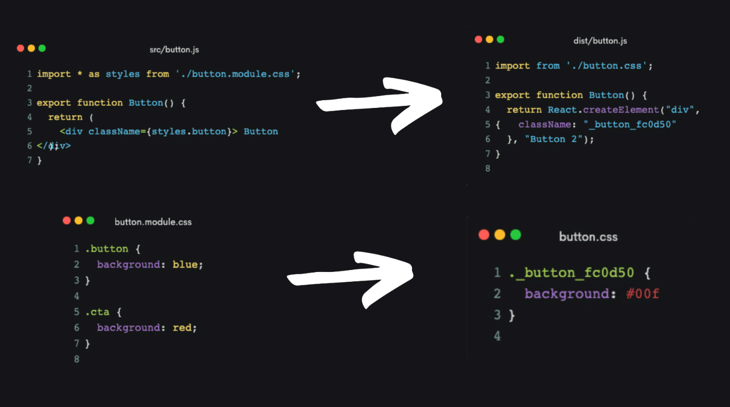
In this example, the .title and .description classes in styles.module.css are scoped to the Component where they are imported. When you build this application, the actual class names applied to the elements will be something like title_1fgh23 and description_2jk34, automatically generated and unique throughout the application. This prevents styles from one component from leaking into another, which can happen with global CSS.
CSS Modules are not a feature of CSS itself but rather a build step in modern front-end pipelines, typically implemented using a bundler like Webpack, Rollup, or Parcel, which handle the scoping and importing of the CSS Modules.
3. Preprocessor
A CSS preprocessor is a scripting language that extends the default capabilities of CSS. It allows developers to use features not available in pure CSS, such as variables, nesting, mixins, inheritance, and other powerful functionalities that make writing CSS more maintainable and easier to write.
Preprocessors need to compile your code into standard CSS so that browsers can interpret it. This compilation can happen during a build process on a server, or on the fly in the development environment.
Some of the most popular CSS preprocessors include:
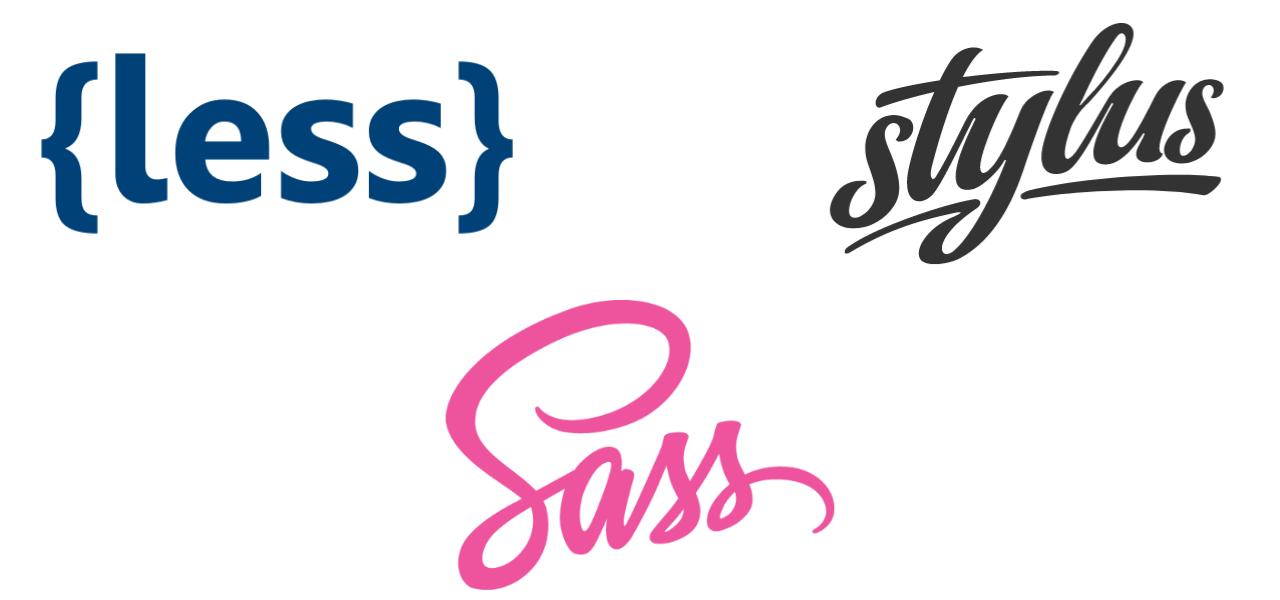
- Sass (Syntactically Awesome Stylesheets): Uses the .scss or .sass file extension. It's the most widely used preprocessor syntax. SCSS syntax is similar to CSS but with the power of Sass features.
- LESS: Stands for Leaner Style Sheets. It influenced the creation of SCSS and also allows for variables, nesting, and so on, using a syntax similar to CSS and the .less file extension.
- Stylus: Similar to Sass and LESS, but with a more flexible syntax that can be both strict and lenient, allowing developers to choose their style preference.
These tools can greatly improve productivity and can help to organize large stylesheets by breaking them down into smaller, more manageable pieces. For example, variables allow you to define a color or font-stack once and use it throughout the stylesheet, ensuring consistency and making it easier to implement theme changes.
4. CSS-in-JS
CSS-in-JS refers to a pattern where CSS is composed within JavaScript files. This approach enables developers to write CSS that is tied directly to their JavaScript components, leading to a more integrated approach to styling in component-based frameworks and libraries like React.
Here are some key features and benefits of CSS-in-JS:
- Local Scope: Styles defined in a CSS-in-JS file are scoped locally to the component, similar to CSS Modules. This means that the styles are less likely to conflict with styles in other parts of the application.
- Dynamic Styling: Since the styles are written in JavaScript, developers can easily manipulate styles based on the component's state or props, making it straightforward to implement dynamic styling.
- Co-location: CSS-in-JS allows developers to keep the styles that affect a component within the same file as the component code, which can make the component easier to understand and maintain.
- Dead Code Elimination: It's easier for build tools to perform dead code elimination, removing unused CSS from the final bundle.
- Theming: Many CSS-in-JS libraries offer built-in theming capabilities, making it simple to apply a theme across all components of an application.
Examples of CSS-in-JS libraries include:
- Styled-components: Allows you to write actual CSS code to style your components in JavaScript files.
- Emotion: Offers a similar API to styled-components but with a different set of features and optimizations.
- JSS: A more explicit approach to CSS-in-JS, which uses JavaScript objects to represent styles.
Here is a simple example using styled-components in a React application:
In this example, StyledButton is a React component with styles attached directly to it. These styles are scoped to this component only, and the hover state is styled directly within the component's definition.
CSS-in-JS has been a topic of some debate within the development community, with proponents valuing its flexibility and component-scoped approach, while detractors point to potential performance issues and a deviation from the traditional separation of concerns in web development (where structure, presentation, and behavior are typically kept separate).
5. Utility Classes
Utility classes, also known as helper classes, in the context of CSS, are short, reusable classes that serve a single specific purpose. They are a key component of functional CSS, a styling paradigm that encourages the use of these atomic classes to build up the styles on an element by combining multiple utility classes rather than writing new custom CSS for each element or component.
Here's what characterizes utility classes:
- Single Responsibility: Each utility class applies one specific style or a small, related set of styles. For example, a utility class might add a margin, change text color, or set a display property, but it won't do all three.
- Reusable: Utility classes are designed to be reused throughout the HTML wherever a particular style is needed.
- Composable: You can combine multiple utility classes to achieve the desired look without writing custom CSS.
- Consistent: By using utility classes, you enforce consistency across the design, as you are limited to the set of styles defined by the utility classes.
Here are a few examples of utility classes:
- .text-center might apply text-align: center;
- .mt-4 might apply margin-top: 1rem; (assuming a spacing scale where 4 equals 1rem)
- .bg-primary might apply a background color that's been designated as the primary color in your style guide
- .d-block could be used to set display: block;
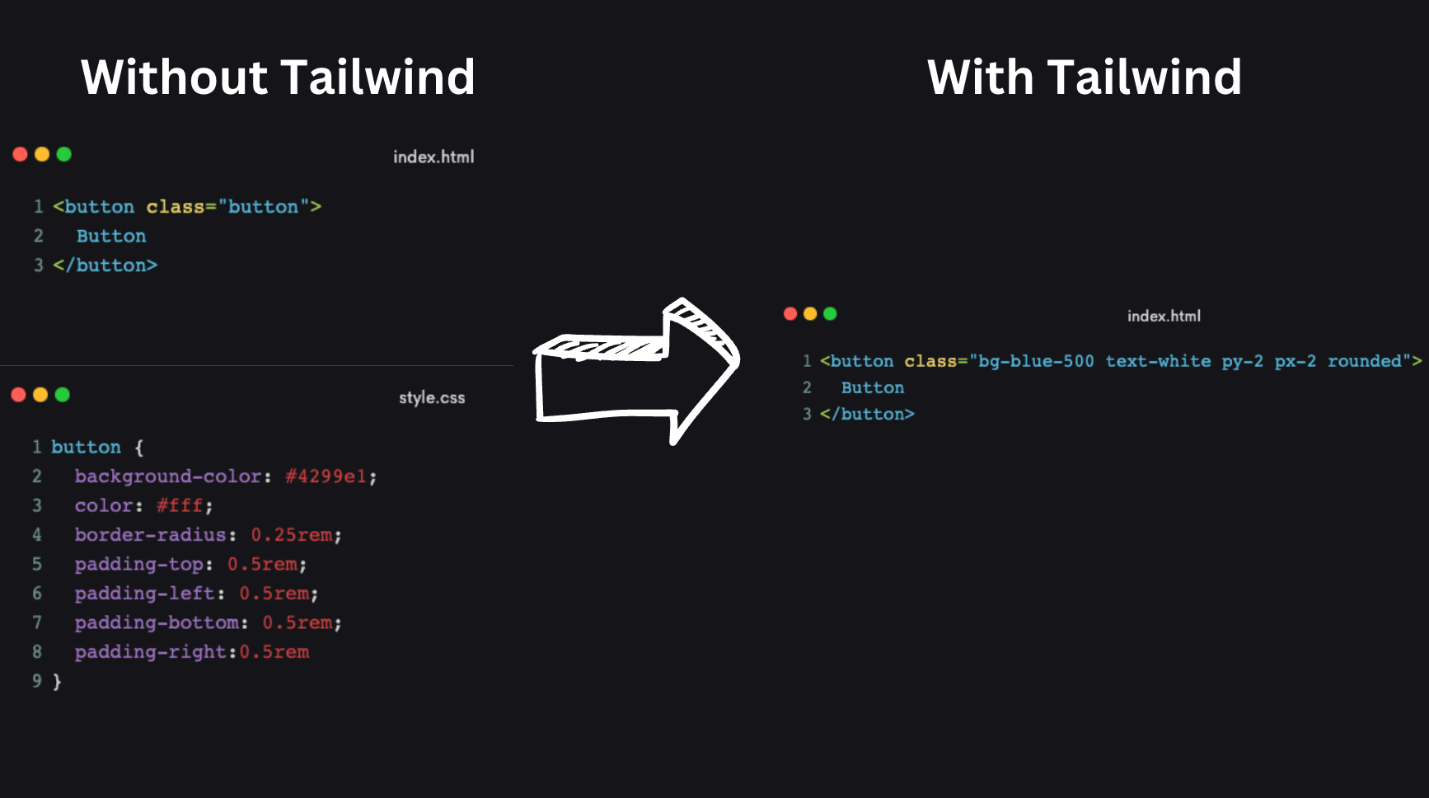
Many popular CSS frameworks like Tailwind CSS, Bootstrap, and Tachyons emphasize utility-first CSS, providing a wide range of utility classes that cover most styling needs.
The utility classes approach has its proponents and critics. Some developers appreciate the speed and convenience of building interfaces without writing much custom CSS, while others criticize it for leading to verbose HTML and potential readability issues. It's a matter of preference and project requirements.
6. CSS Framework
A CSS framework is a pre-prepared library that is meant to be used as a base for starting the development of a website. It typically provides a grid system, set of reusable components, and utility classes that standardize the design process and help to ensure responsiveness and cross-browser compatibility.
The key features of a CSS framework can include:
- Grid System: Helps in creating page layouts through a series of rows and columns that house your content.
- Predefined Styles: Comes with ready-to-use styles for typography, forms, buttons, tables, navigation bars, and other interface components.
- Responsive Design: Most frameworks have a mobile-first approach and include media queries for different screen sizes to ensure the design is responsive and mobile-friendly.
- Cross-Browser Compatibility: Includes styles normalized across different browsers to reduce the inconsistencies that can arise from the default styles provided by browsers.
- Customization: Often allows for customization, enabling developers to override default styles and integrate the framework's features with a site's unique design.
- Utility Classes: Provide utility classes for common tasks like hiding elements, changing text alignment, or adjusting padding and margin.
- JavaScript Integration: Some frameworks also come with JavaScript components to add functionality to elements like modals, dropdowns, and tabs.
Popular CSS frameworks include:
- Bootstrap: One of the most popular frameworks with a large community, extensive documentation, and a wide range of components.
- Foundation: Focuses on being an enterprise-grade framework that provides professional and flexible design capabilities.
- Tailwind CSS: A utility-first framework that provides low-level utility classes to build designs directly in your markup.
- Bulma: A modern framework that is based on Flexbox and is known for its simplicity and ease of use.
- Materialize: A framework based on Material Design principles that provides components and animations that conform to Google's Material Design guidelines.
CSS frameworks are a significant boon for rapid development and prototyping, as they can save time and effort in setting up the basic design structure. However, they may also come with a learning curve, and in some cases, they can lead to bloated codebases if not used carefully. It's important for developers to weigh the pros and cons and choose a framework that best fits the project's needs.
7. Component library
A component library is a collection of reusable components for a web or mobile application. These components can range from simple elements like buttons and input fields to complex UI constructs like date pickers, modals, and data grids. The idea behind a component library is to provide a consistent set of building blocks that developers can use to assemble user interfaces more efficiently.
Key aspects of component libraries include:
- Reusability: Components are designed to be reused across different parts of an application or even across different projects.
- Consistency: By using components from the same library, you ensure a consistent look and feel across your application, which is important for user experience and brand identity.
- Efficiency: Developers save time since they don't need to write common UI elements from scratch.
- Maintainability: Updating styles or behaviors can be done in a single place, and changes are reflected everywhere the component is used.
- Documentation: Component libraries usually come with documentation that describes how to use the components and what properties they accept.
- Customization: Many component libraries allow for extensive customization to fit the design and functionality needs of your project.
Component libraries can be either general-purpose or domain-specific:
- General-Purpose Libraries like Material-UI, Ant Design, and Bootstrap's React components offer a wide range of elements for general use in building web applications.
- Domain-Specific Libraries provide components tailored to specific industries or applications, such as a mapping UI library for location-based apps.
Many modern front-end frameworks like React, Vue, and Angular have their own ecosystems of component libraries. These libraries adhere to the framework's principles and are designed to integrate seamlessly into projects using those frameworks.
Using a component library can dramatically speed up the development process, but it's important to choose one that aligns with the project's needs, as it can be difficult to switch libraries once development is underway.